-
Tufte Example,
Alexander Carlton,
Tufte Example
The page you are reading is an adaptation of the Tufte CSS example page, which itself is a sample page used to demonstrate the features of a set of CSS that enabled certain web materials to follow ideas expressed in Edward Tufte's work.
This page here is offered as an example of how this kind of material can be written in reStructuredText through the use of the B-side theme in Hugo, and how the behavior has evolved to work within the constraints of Hugo and this B-side theme. The content and the flow of the material on this page follow directly from the original Tufte CSS page, adjustments were made as necessary to fit the specifics of the B-side implementation.
Hugo B-side does not attempt to adhere strictly to Tufte's work, but has been influenced by his writings. The development of the this theme has also been influenced by other projects which have spun out of the Tufte CSS work, with the most obvious alternative contributions coming from Envisioned CSS.
Those interested in a pure CSS implementation following Tufte's designs are encouraged to consider the excellent Tufte CSS project. You can start by exploring the links in the original Tufte CSS material that is quoted in the sidebar to the right of this text. Those interested in similar behavior with a different, perhaps more "modern", aesethic should review the Envisioned CSS project referenced above.
Getting Started
Hugo B-side requires no special setup to be used in this main-and-margin column format – all that is required is some care with using reStructuredText directives and the CSS provided will format the resulting elements accordingly.
Fundamentals
Sections and Headings
Organize your document like any other reStructuredText document. For approximating this Tufte look, use the top-level heading for the document title, and the second-level headings for section headings, with the third-level headings for low-level headings. All of the HTML recognized headings (H1 through H6) are supported, but are not in keeping with Tufte guidance. If you feel the urge to reach for a heading of level 4 or greater, consider redesigning your document:
[It is] notable that the Feynman lectures (3 volumes) write about all of physics in 1800 pages, using only 2 levels of hierarchical headings: chapters and A-level heads in the text. It also uses the methodology of sentences which then cumulate sequentially into paragraphs, rather than the grunts of bullet points. Undergraduate Caltech physics is very complicated material, but it didn’t require an elaborate hierarchy to organize.
—Edward Tufte, forum post, ‘Book design: advice and examples’ thread
As a bonus, this excerpt regarding the use of headings provides an example of block quotes. In reStructuredText they result in semantically correct HTML using blockquote and attribution elements, which are then lightly styled in the B-side CSS. See page 20 of The Visual Display of Quantitative Information for an example in print.
In his later books Tufte starts each section with a bit of vertical space, a non-indented paragraph, and the first few words of the sentence set in small caps. For this we use a reStructuredText role with the class newthought, as demonstrated at the beginning of this paragraph.
.. role:: newthought

:newthought:`In his later books` Tufte
starts each section with a bit of vertical space,
Admittedly, the support for this feature in B-side is simplistic – here we are just specifying small-caps as the font-variant CSS property. The real weakness is that there is no solid means of forcing increased spacing between a newthought and the preceeding paragraph, so in some cases CSS's "margin collapse" behavior will override a newthought's large padding defintion.
Text
Although paper handouts obviously have a pure white background, the web is better served by the use of slightly off-white and off-black colors. The B-side theme uses #fffff6 and #111111 which are mostly indistinguishable from their ‘pure’ cousins, but dial down the harsh contrast and lean a bit towards warmer hues. We stick to the greyscale for text, reserving color for the content's specific, careful use in figures and images.
| [1] | See Tufte’s comment in the Tufte book fonts thread. |
In print, Tufte has used the proprietary Monotype Bembo[1] font. Here we break from the Tufte guidance, and follow closer to the approach championed by Envisioned CSS. The B-side theme is based on the Google Roboto font. Arguably not as nice as Bembo or even the now open-source ETBook, B-side acknowleges that the web is not print; much of the web lacks the fine resolution that make good serifs a joy to read, web also lacks the predicability that comes from pre-printed ink and paper. Perhaps as electronic displays begin to rival paper for readability, then we will be able to again take advantage of good serif typefaces.
The B-side theme does explictly load the bold and italic variants of Roboto for bold (strong) and italic (emphasis), instead of relying on the browser to mechanically transform the text. This is typographic best practice. If necessary, B-side will degrade to load Ariel (common on Windows-based systems), Helvetica (common on the Apple systems), and fall back to the bare sans-serif in the worst case.
Links in B-side CSS match the body text in color and do not change on mouseover or when clicked. Here is a dummy example link that goes nowhere. These links are underlined, since this is the most widely recognized indicator of clickable text.
However, because most browsers’ default underlining does not clear descenders and is so thick and distracting, the underline effect is instead achieved using CSS trickery involving background gradients instead of standard text-decoration. Credit goes to Adam Schwartz for the technique – we are impressed, and grateful.
Epigraphs
The English language . . . becomes ugly and inaccurate because our thoughts are foolish, but the slovenliness of our language makes it easier for us to have foolish thoughts.
—George Orwell, “Politics and the English Language”
For a successful technology, reality must take precedence over public relations, for Nature cannot be fooled.
—Richard P. Feynman, “What Do You Care What Other People Think?”
I do not paint things, I paint only the differences between things.
—Henri Matisse, Henri Matisse Dessins: thèmes et variations (Paris, 1943), 37
| [2] | Beautiful Evidence |
If you’d like to introduce your page or a section of your page with some quotes, use epigraphs. Modeled after chapter epigraphs in Tufte’s books (particularly Beautiful Evidence [2]), these are blockquote elements with a bit of specialized styling. Quoted text is italicized. We have provided three examples in the epigraph of this section, demonstrating shorter and longer quotes, with and without a paragraph tag, and showing how multiple quotes within an epigraph fit together with the use of a single directive.
Sidenotes: Footnotes and Marginal Notes
| [*] | This is a sidenote. |
One of the most distinctive features of Tufte’s style is his extensive use of sidenotes[*]. Sidenotes are like footnotes, except they don’t force the reader to jump their eye to the bottom of the page, but instead display off to the side in the margin. The B-side theme implements both notes, footnotes and sidenotes, with the same place-in-the-margin behavior.
In reStructuredText, notes (whether footnotes or sidenotes) can be where ever the author wants in document. To use as sidenotes with B-side, define the sidenote where you want the sidenote to appear (usually close to where the note is referenced from).
.. [*] This is a sidenote.
Sidenotes are a great example of the web not being like print. On sufficiently large viewports, the B-side theme uses the margin for sidenotes, margin notes, and small figures. On smaller viewports, elements that would go in the margin are pushed to the right-hand edge and isolated as separate elements with different line-spacing and other visual cues to create some separation. The goal is to present related but not necessary information such as asides or citations as close as possible to the text that references them. At the same time, this secondary information should stay out of the way of the eye, not interfering with the progression of ideas in the main text.
If you want a sidenote without footnote-style numberings, then you want a margin note, which we implement using reStructuredText's sidebar directive.
On large screens, a margin note is just a sidenote that omits the reference number. This lessens the distracting effect taking away from the flow of the main text, but can increase the cognitive load of matching a margin note to its referent text. However, on small screens, both margin notes and sidenotes are implemented as text boxes pushed out to the right edge.
An example of how to mark up a margin note by use of a sidebar:
.. sidebar:: Margin Note
   :class: titleless

   This is a margin note. Notice there isn’t a number preceding the note.
Note: no plaintext markup solution is going to be able to manage all of the careful details that make books like those of Edward Tufte such a pleasure to read – much of that elegance comes from taking great care to get the details right, and plaintext markup systems favor simplicity more than fine-grain details.
| [†] | This note was defined above the paragraph. |
One of those details that is compromised is the exact placement of these notes. In Tufte CSS, by using raw HTML one has character-level control over the placement of notes (a note, whether marginnote or footnote, can be tied to any specific word in the running text). Like most plaintext markup systems that favor readability of the raw material, reStructuredText works mostly with blocks of text as opposed to working character by character. Therefore, with B-side, notes can be implemented at the beginning[†] or at the end of a block[‡], not in the middle of a block of text. Notes will be placed in the margin starting at the same vertical position as the next paragraph in the text running in the main column. If desired, a footnote[§] can be implemented by placing one or more notes at the end of the markup text.
| [‡] | This note was defined below the paragraph. |
The careful reader may have noted that some of the notes in this article have been marked with numeric labels while others have been marked with symbols. reStructuredText actually implements three different sets of notes: numeric notes, symbolic notes, and citations. Each of these sets are tracked independently, which offers an author some flexibility in how the notes are used; for example, perhaps an author can use the symbolic notes for the sidenotes and use the numeric notes for footnotes. More information about the support for notes can be found in the footnote section of [ReST].
Figures
Tufte emphasizes tight integration of graphics with text. Data, graphs, and figures are kept with the text that discusses them. In print, this means they are not relegated to a separate page. On the web, that means readability of graphics and their accompanying text without extra clicks, tab-switching, or scrolling.
Figures should try to use the figure directive, which by default are constrained to the main column. For example, most of the time one should introduce a figure directly into the main flow of discussion, like so:
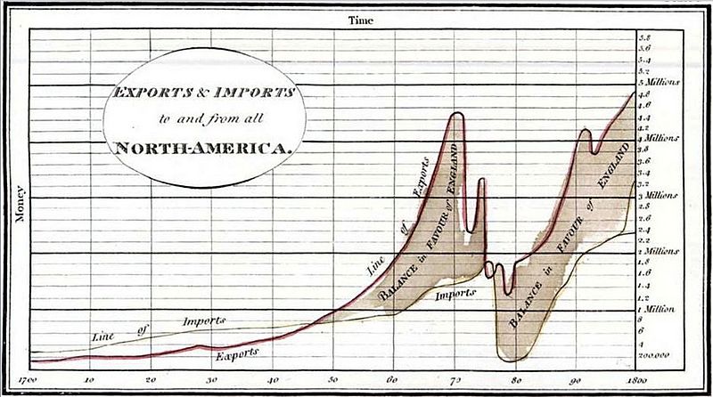
After an image from Edward Tufte, Visual Display of Quantitative Information, page 92 [JPG file from Wikimedia Commons: 1786 Playfair]
.jpg)
The figure above can be implemented with:
.. figure:: 1786_Playfair_Export_Import.jpg
   :alt: Exports and Imports to and from Denmark & Norway from 1700 to 1780
   :align: left

   After an image from Edward Tufte, etc...
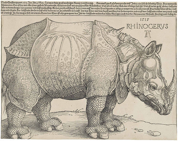
F.J. Cole, “The History of Albrecht Dürer’s Rhinoceros in Zooological Literature,” Science, Medicine, and History: Essays on the Evolution of Scientific Thought and Medical Practice (London, 1953), ed. E. Ashworth Underwood, 337-356. From page 71 of Edward Tufte’s Visual Explanations [JPG file from Wikimedia Commons: Durer's Rhinoceros]
But tight integration of graphics with text is central to Tufte’s work even when those graphics are ancillary to the main body of a text. In many of those cases, a margin figure may be most appropriate. To place figures in the margin, just place the figure within a sidebar directive as seen to the right of this paragraph.
An example implementation of a figure within a sidebar:
.. sidebar:: rhino
   :class: titleless

   .. figure:: Rhinoceros.jpg
      :alt: Image of a Rhinoceros"

      F.J. Cole, etc...
If you need a full-width figure, add the fullwidth class to the figure directive and it will take up (almost) the full width of the screen. This approach is demonstrated below using Edward Tufte’s English translation of the Napoleon’s March data visualization. From Beautiful Evidence, page 122-124.
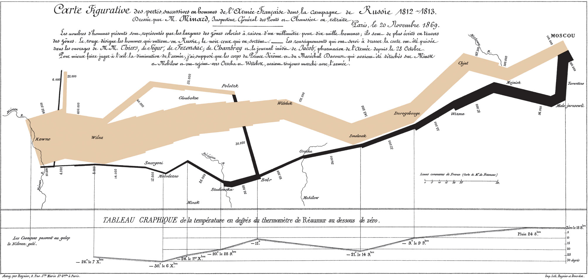
Figurative map of the successive losses of the French Army in the Russian campaign, 1812-1813 [PNG file from Wikimedia Commons: Minard]
In markup:
.. figure:: Minard.png
   :alt: Figurative map of the successive losses ...
   :class: fullwidth

   Figurative map of the successive losses of the French Army ...
Code
Technical jargon, programming language terms, and code samples are denoted with the code directive, as I’ve been using in this document to denote HTML. Code needs to be monospace for formatting purposes and to aid in code analysis, but it must maintain its readability. To those ends, B-side utilizes Roboto Mono for a fixed-width font consistent with the base font.
;; Some code examples in Clojure. This is a comment.

;; applying a function to every item in the collection
(map tufte-css blog-posts)
;;;; if unfamiliar, see http://www.lispcast.com/annotated-map

;; side-effecty loop (unformatted, causing text overflow) - from https://clojuredocs.org/clojure.core/doseq
(doseq [[[a b] [c d]] (map list (sorted-map :1 1 :2 2) (sorted-map :3 3 :4 4))] (prn (* b d)))

;; that same side-effecty loop, formatted
(doseq [[[a b] [c d]] (map list
                           (sorted-map :1 1 :2 2)
                           (sorted-map :3 3 :4 4))]
  (prn (* b d)))

;; If this proselytizing has worked, check out:
;; http://howistart.org/posts/clojure/1
Epilogue
Many thanks go to Edward Tufte for showing the way with his work. And without the great efforts of Dave Liepmann and his Tufte CSS project we would not have known even where to begin. Any problems with this material stem from failures in my implementation and not from any weaknesses in their inspirations.
| [§] | This note behaves like a footnote because the note itself was defined at the very end of the text. The footnote label has a link that can be used to return to the corresponding location within the text. |
| [ReST] | The reStructuredText reference, <http://docutils.sourceforge.net/rst.html>. |